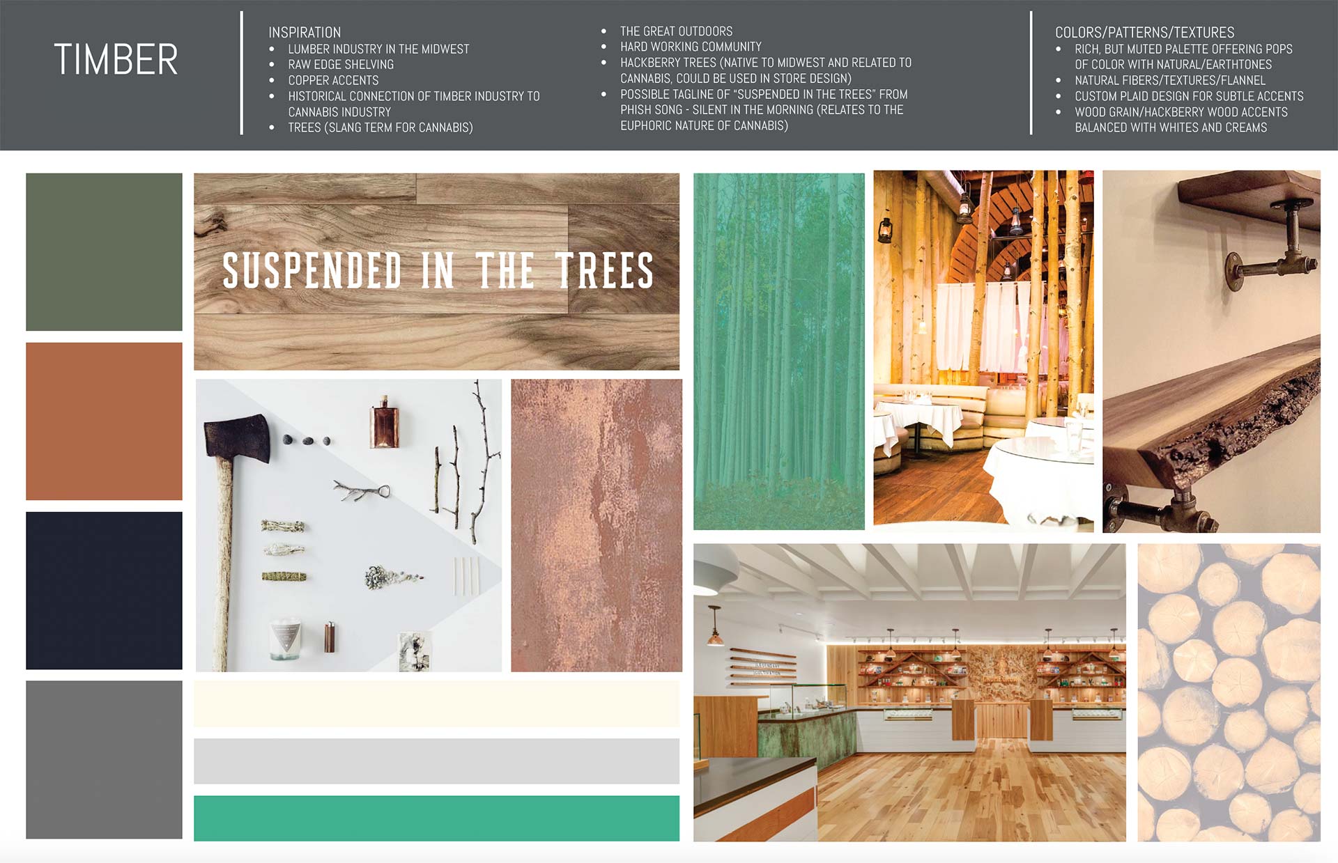
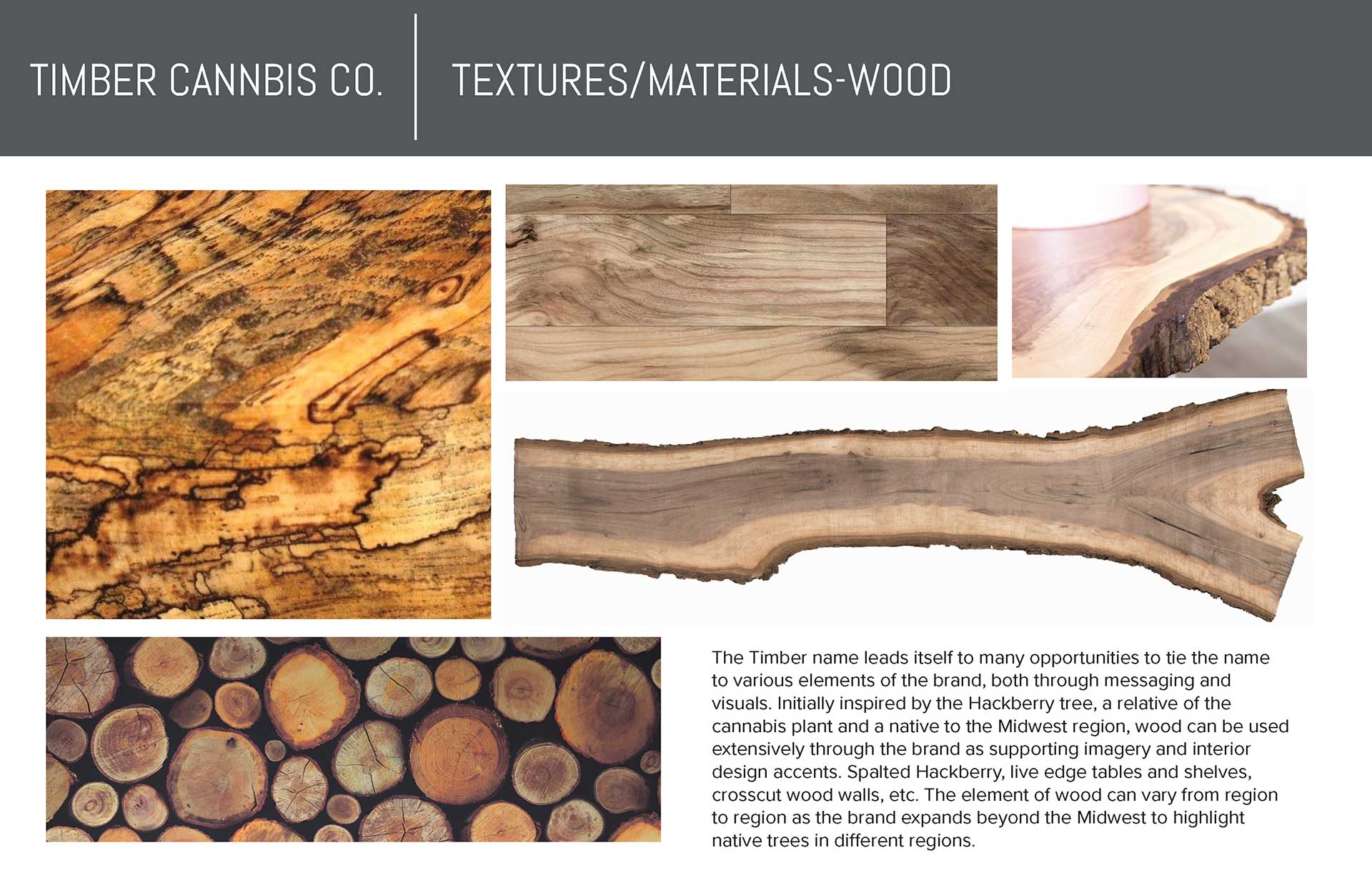
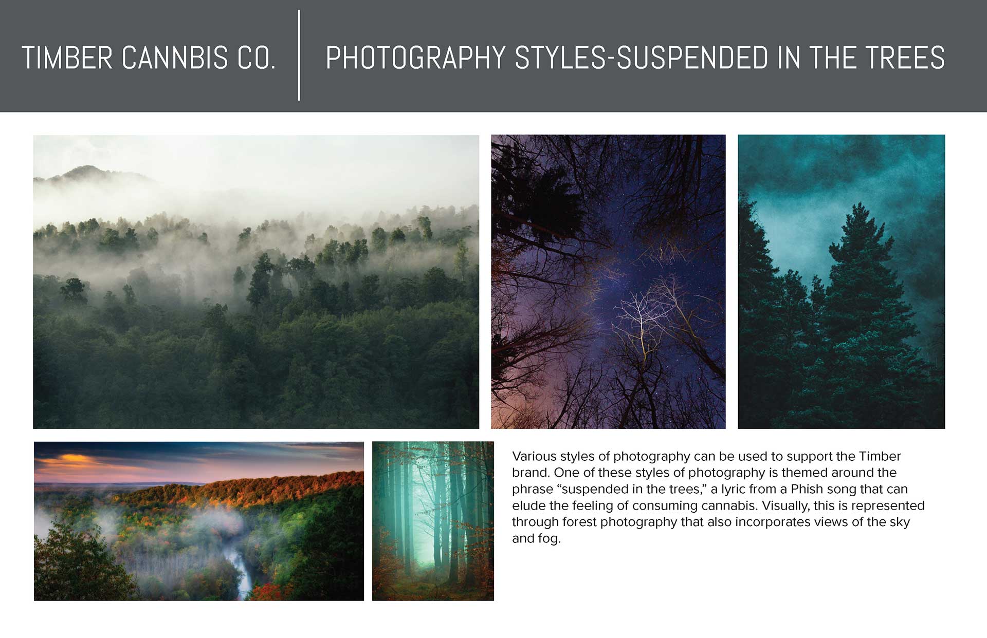
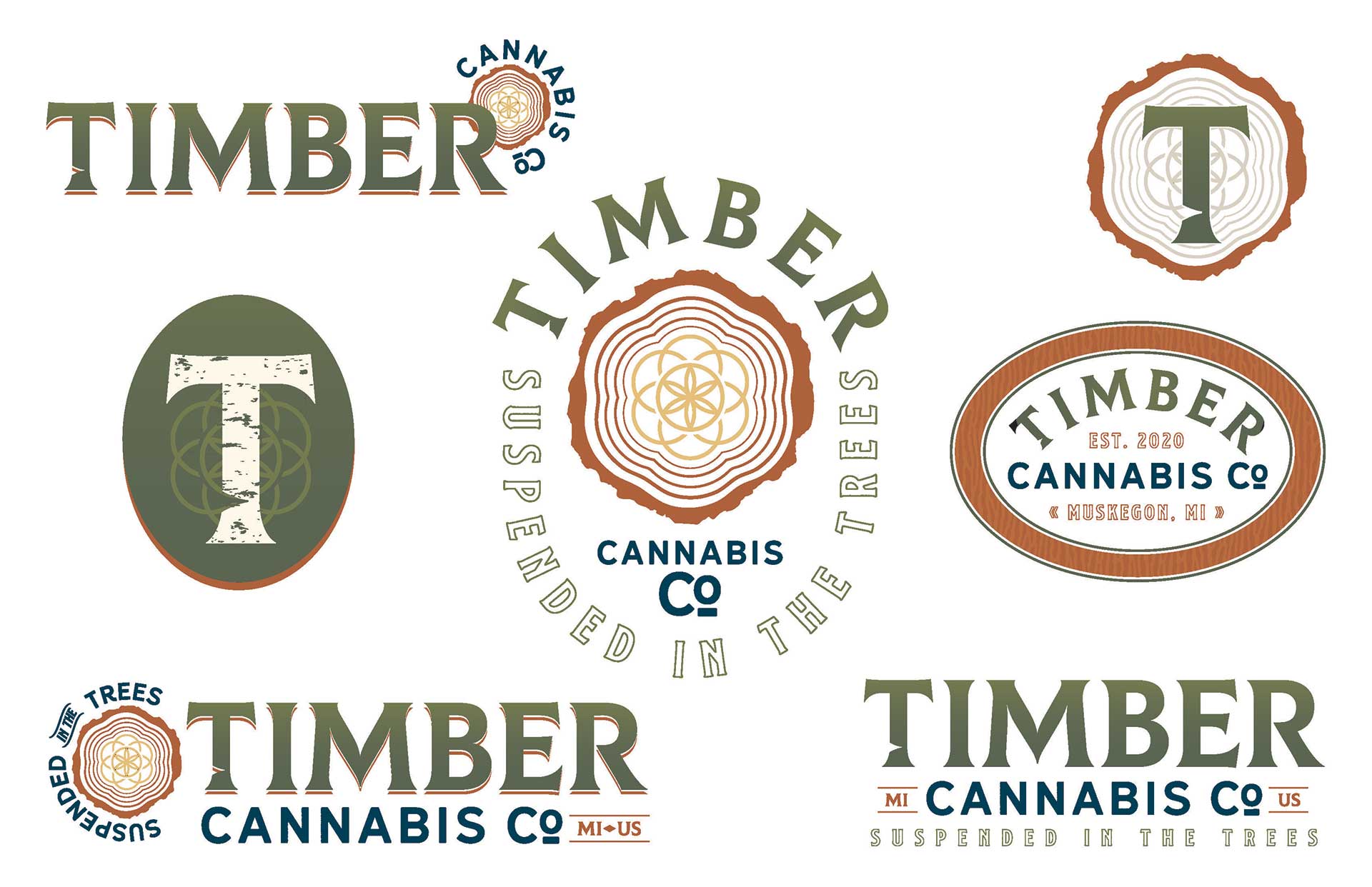
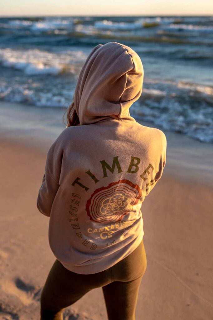
The naming process started with small brainstorms and deep regional research, and Timber emerged as the clear winner for reasons that stack up beautifully. The lumber industry’s deep roots in the Midwest. The little-known history that lumber interests helped drive cannabis prohibition because they feared hemp as a competitor. Trees as old slang for cannabis. The great outdoors and the character of Midwest communities. The Hackberry tree, a native Midwest species and botanical relative of cannabis, which gave us a whole environmental design language. And a quiet Phish nod through the lyric about being suspended in the trees. The founders chose it before we finished the presentation.
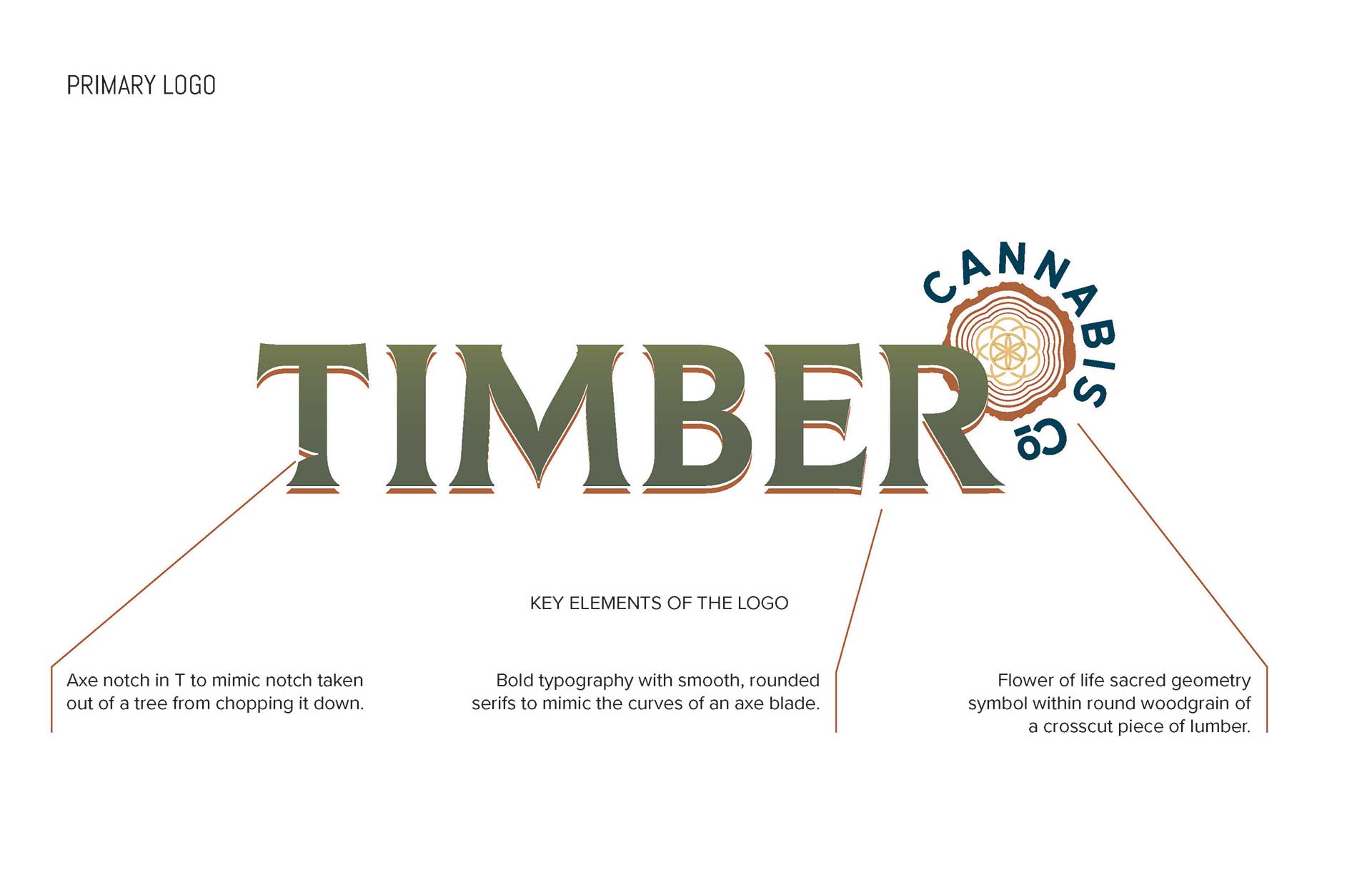
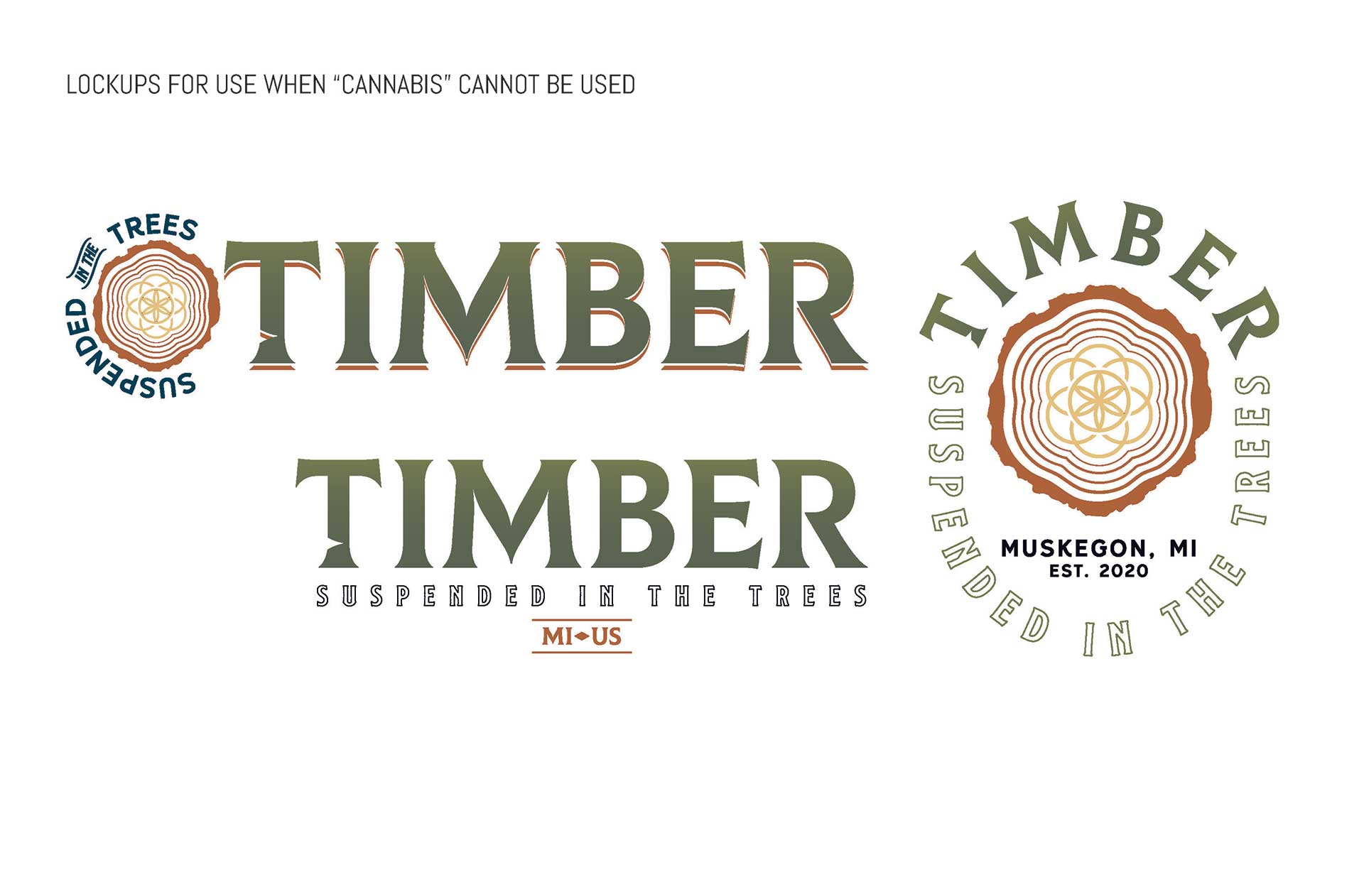
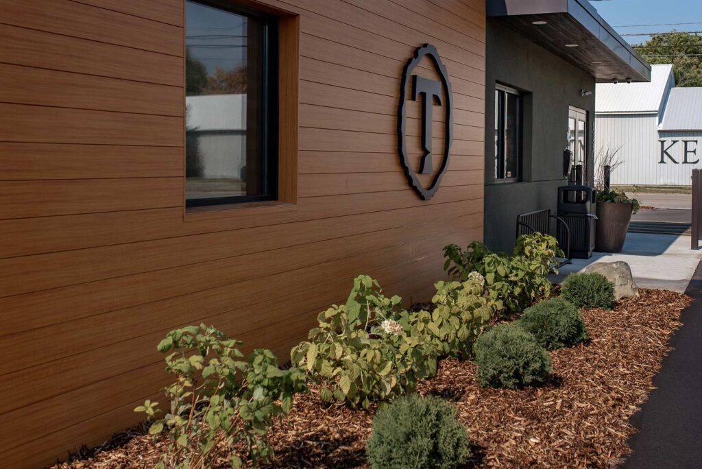
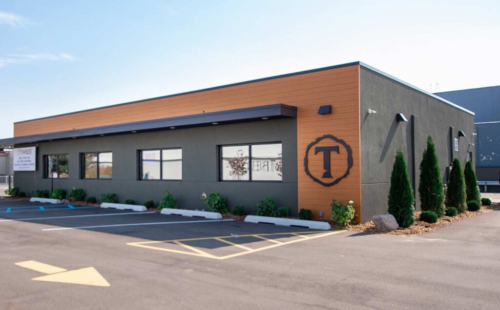
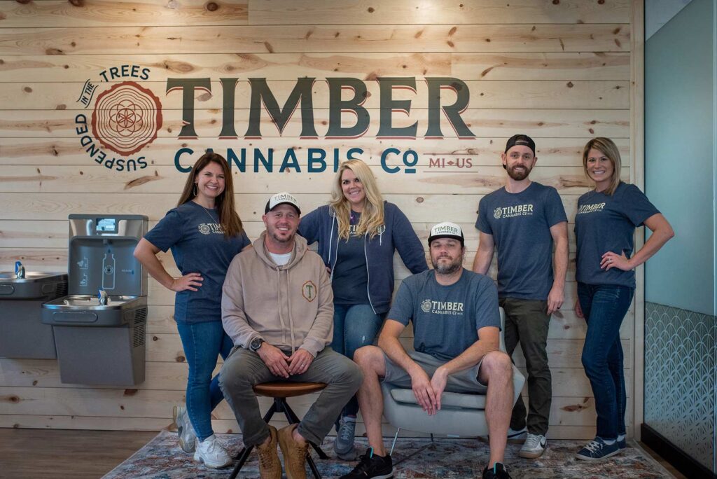
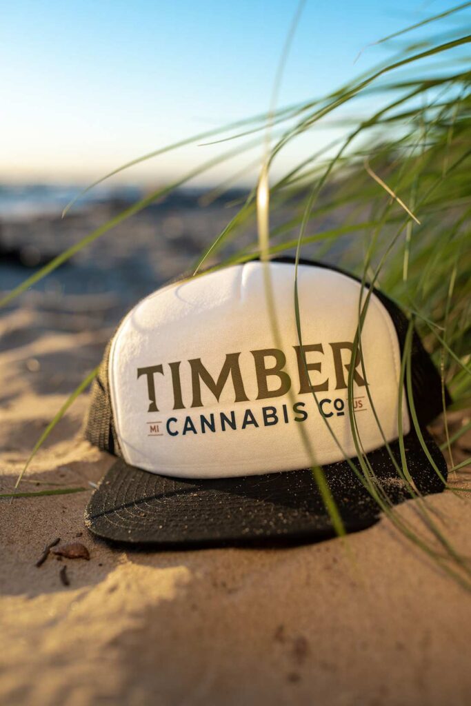
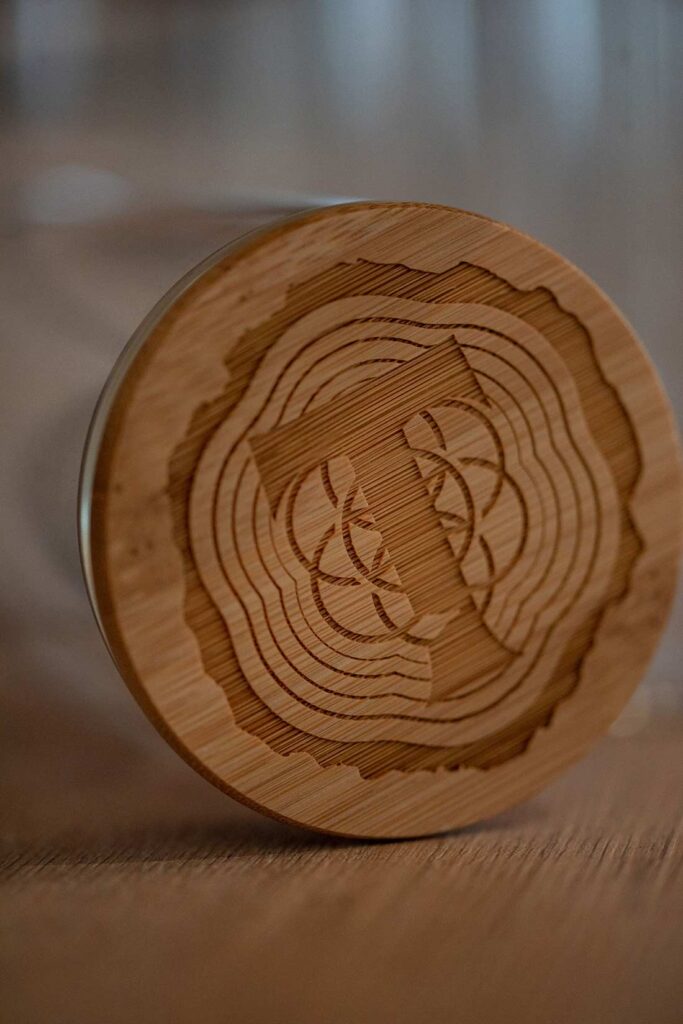
The logo is a bold, chiseled serif with sharp elements that echo the curve of an axe blade. The T carries a custom notch, a wedge taken out of a tree, so it works as a standalone mark and brand shorthand. A secondary circular lockup references a crosscut piece of lumber, with the inner rings forming the Flower of Life in a sacred-geometry style.
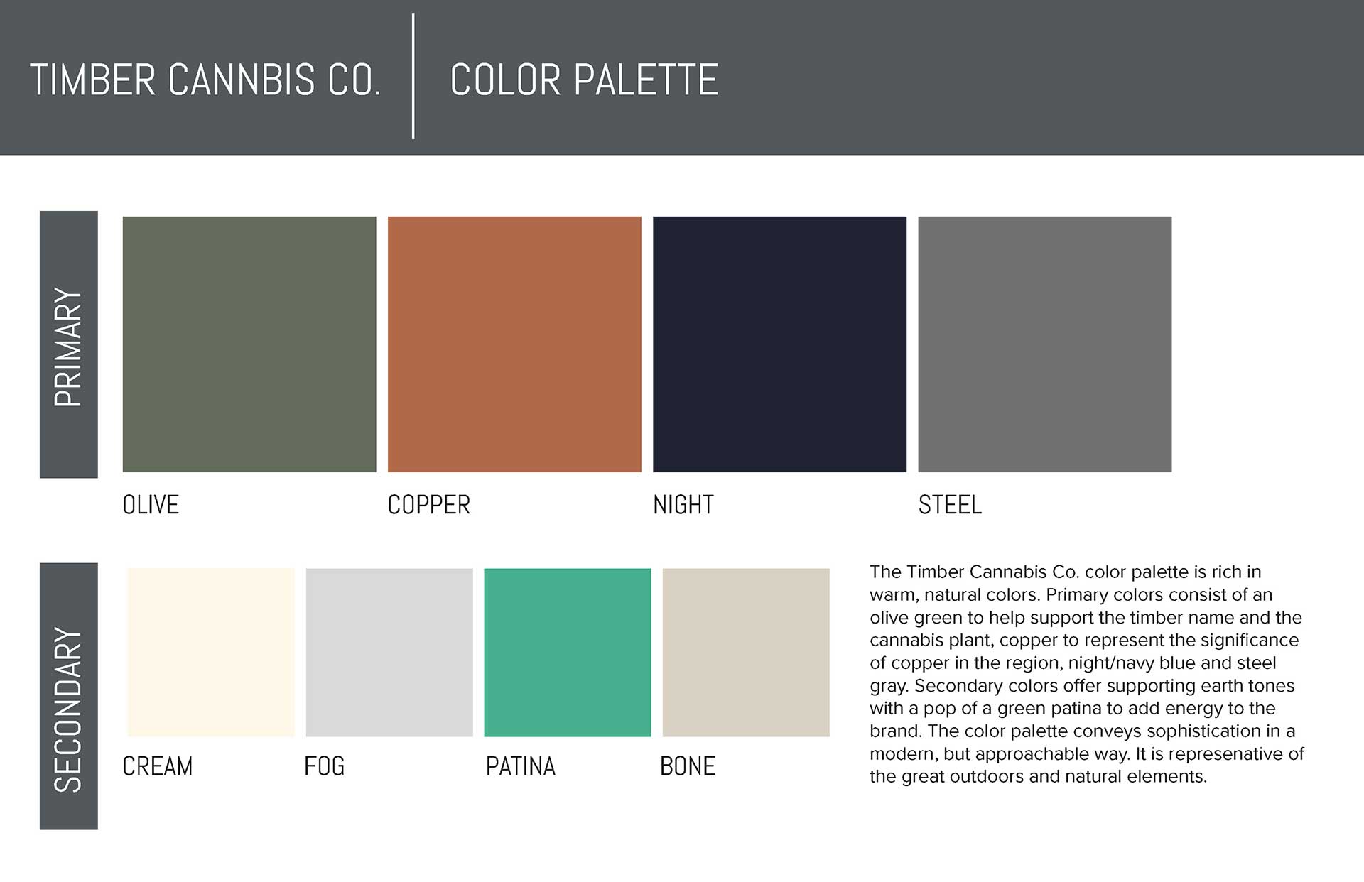
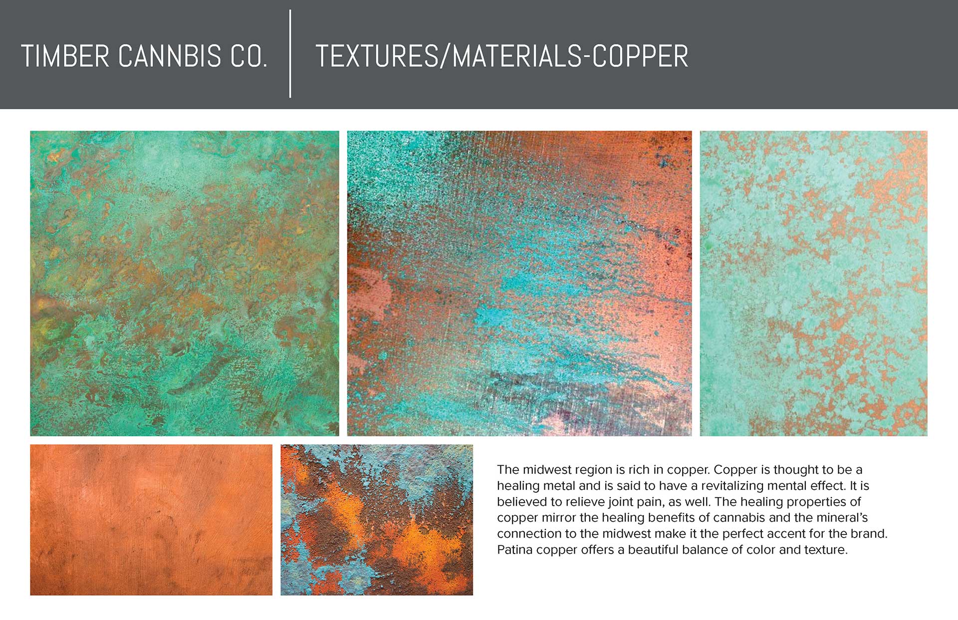
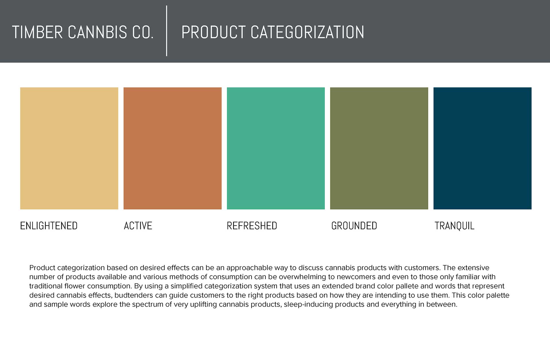
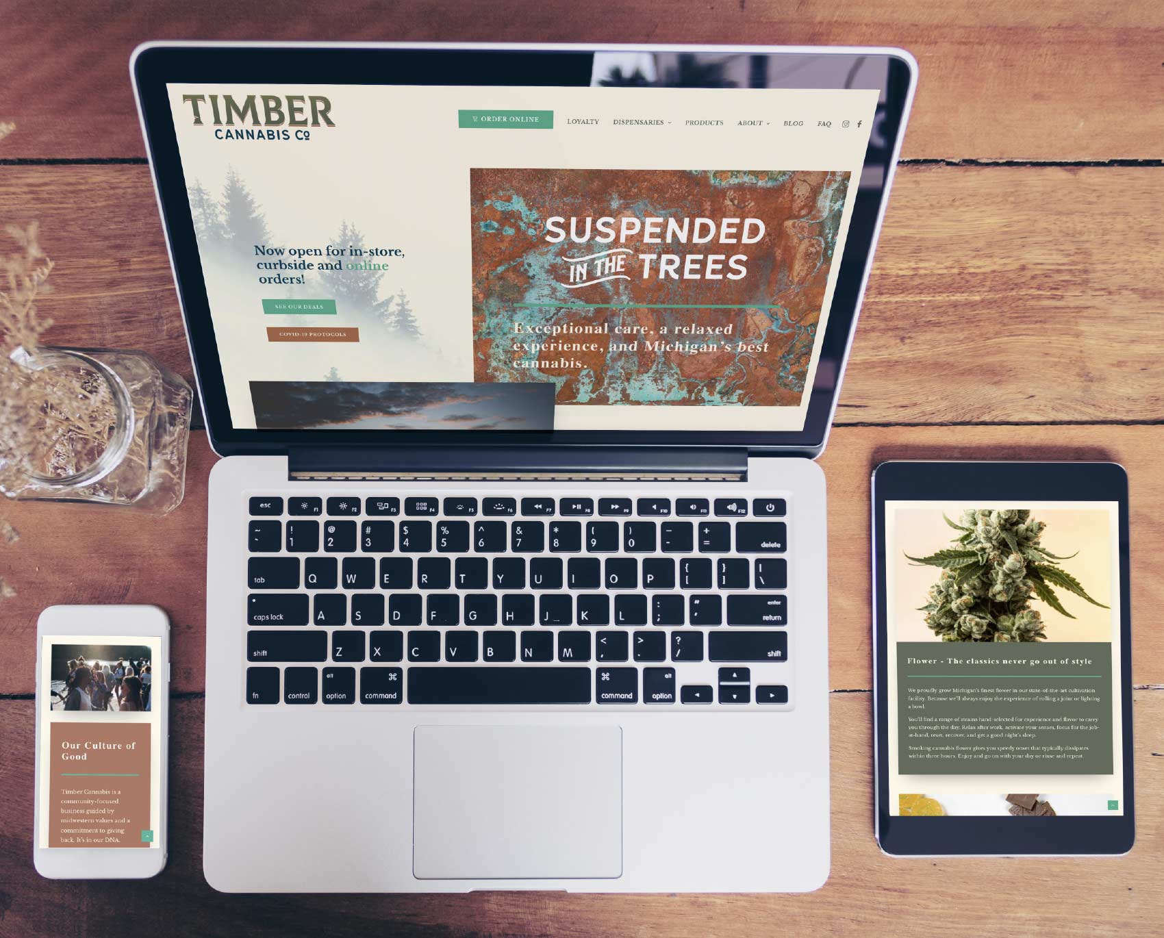
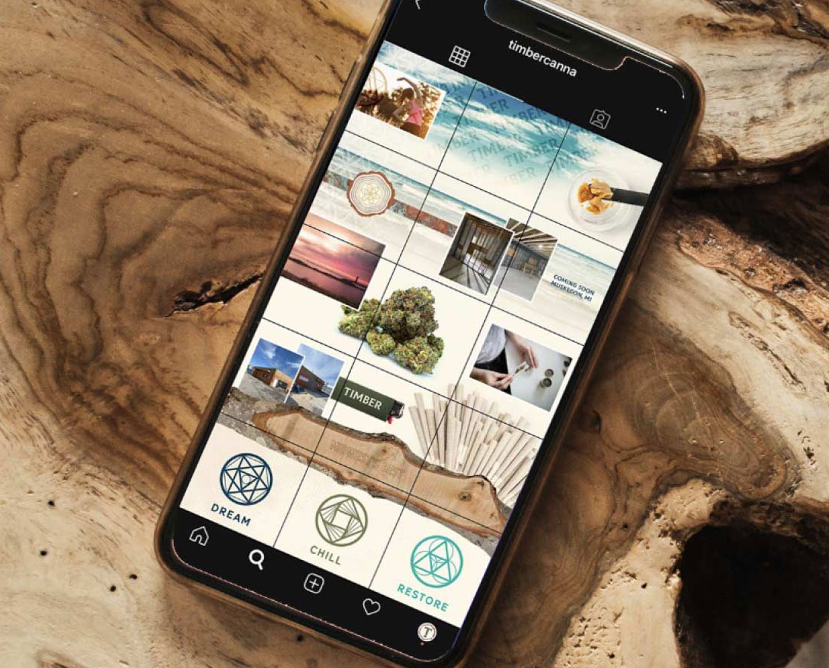
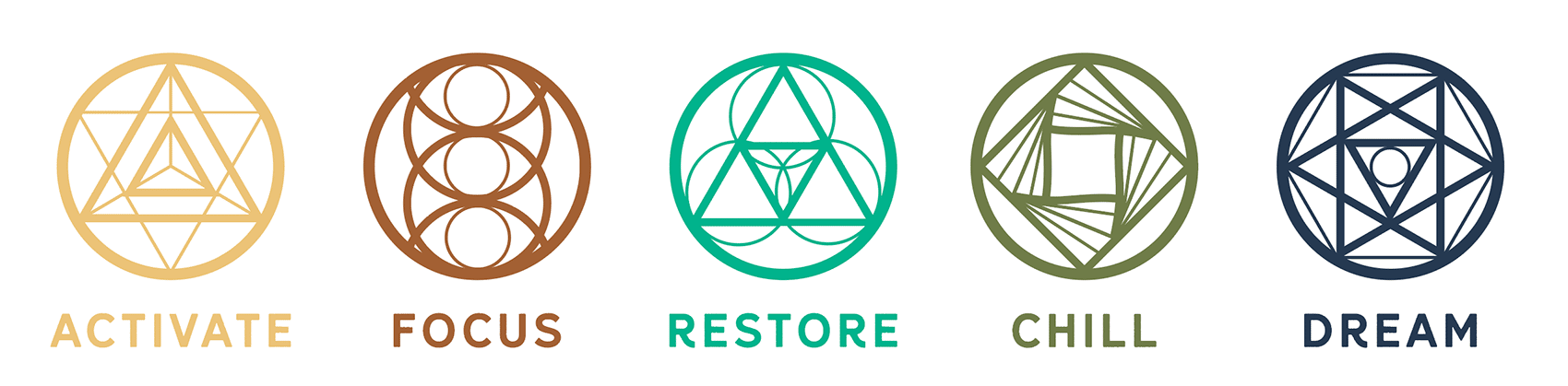
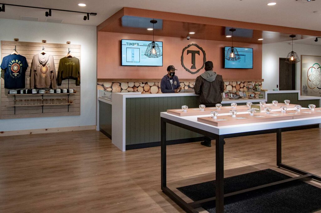
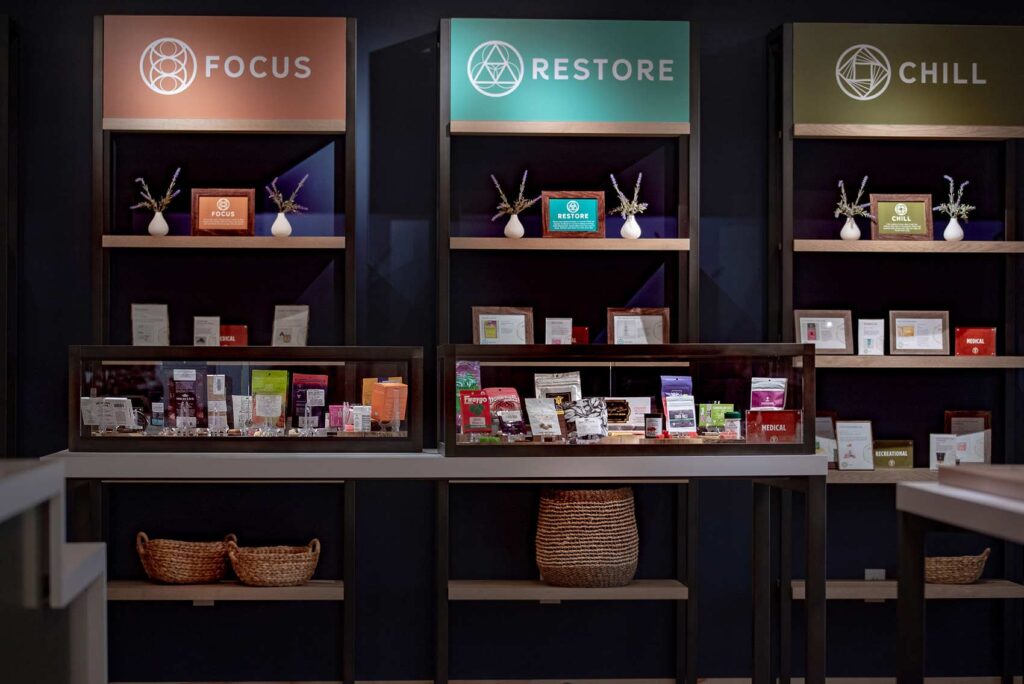
From there I built an effect-based product system, with custom sacred-geometry iconography that helps customers and budtenders align products to goals: Enlightened, Active, Refreshed, Grounded, Tranquil. The palette runs olive green, copper, night navy, and steel gray. Copper does a lot of quiet work here, because it carries real Midwest significance and is regarded as a healing metal, which mirrors the healing associations of cannabis. We brought that history to life through environmental design built around the Hackberry tree, with live-edge tables, crosscut wood walls, and spalted hackberry accents. As Timber expands, each location can bring in its own native regional trees and carry its own environmental story.