Island Cannabis
Full-Spectrum Brand Strategy, From Portfolio Architecture to the Shelf
The SERVICES
Brand Portfolio Audit · Brand Strategy · Research · Audience & Persona Development · Positioning · Visual Identity · Messaging System · Packaging · Go-to-Market
The TEAM
Produced in partnership with Hybrid Marketing Co.
Adam Mendez – Art Director
Aaron Rosenbluth – Content Director
Tyler Jacobson – Director of Marketing
Tom Lamb – Account Manager
INDUSTRY
Cannabis Brand (Illinois, Massachusetts, Washington)
The STORY
We did not start with Island. We started with twenty-two brands that should have been eight.
4Front Ventures is a cannabis multi-state operator with brands across Illinois, Massachusetts, and Washington. They came to us in the middle of real financial difficulty, an honest client who needed help and engaged the process late. Before we touched a single logo, we ran a full brand portfolio audit, because 4Front had accumulated 22 product brands, many with overlapping positioning, no strategy behind them, and unclear roles in the market.
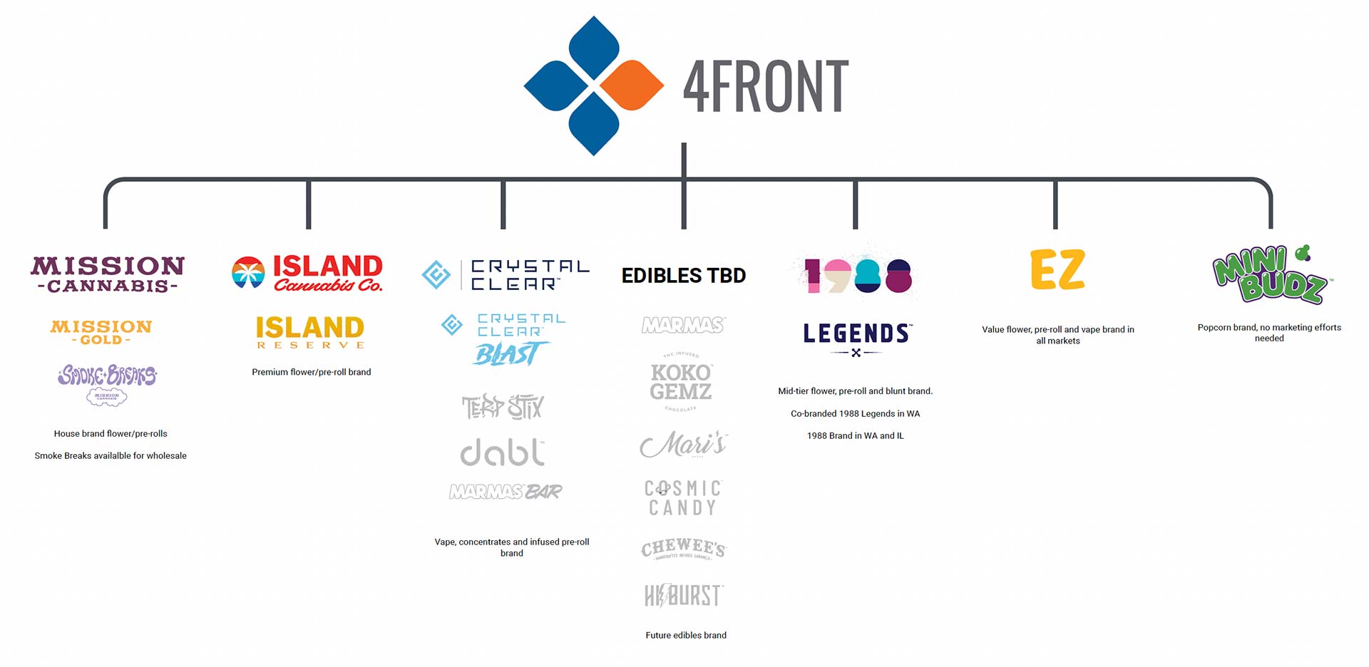
We examined every brand against market performance, positioning opportunity, and strategic fit, and recommended cutting the portfolio from 22 down to 7, each with a clear role and story. Island Cannabis was one of the 7, and we prioritized it for a full strategy rebuild.
The Challenge
The original Island was an internal DIY project. A clip-art palm tree, a simplified sunset, and California visual language built without any strategic intent, with no positioning and no audience. And the geography worked against it, because California beach imagery does not resonate in Illinois or Massachusetts. The brand was speaking a language the markets it served did not understand. The challenge was to find what Island actually meant and make it travel anywhere.
MY CONTRIBUTION
I led the strategy from the portfolio audit through positioning, identity, and go-to-market planning. This is the work I am proudest to show, because it demonstrates the full range, from boardroom-level portfolio architecture all the way down to packaging, executed at a sophisticated level under genuinely hard real-world constraints.
The Work
We grounded everything in research: branding workshops, persona development with empathy mapping, and competitive analysis across Illinois and Massachusetts. The breakthrough insight was simple and freeing. The island concept does not need literal imagery, it needs an emotional state. Everyone understands what it feels like to be on vacation, to exhale, to step away from the grind. The California beach was just one delivery mechanism for that feeling, and we did not need it.
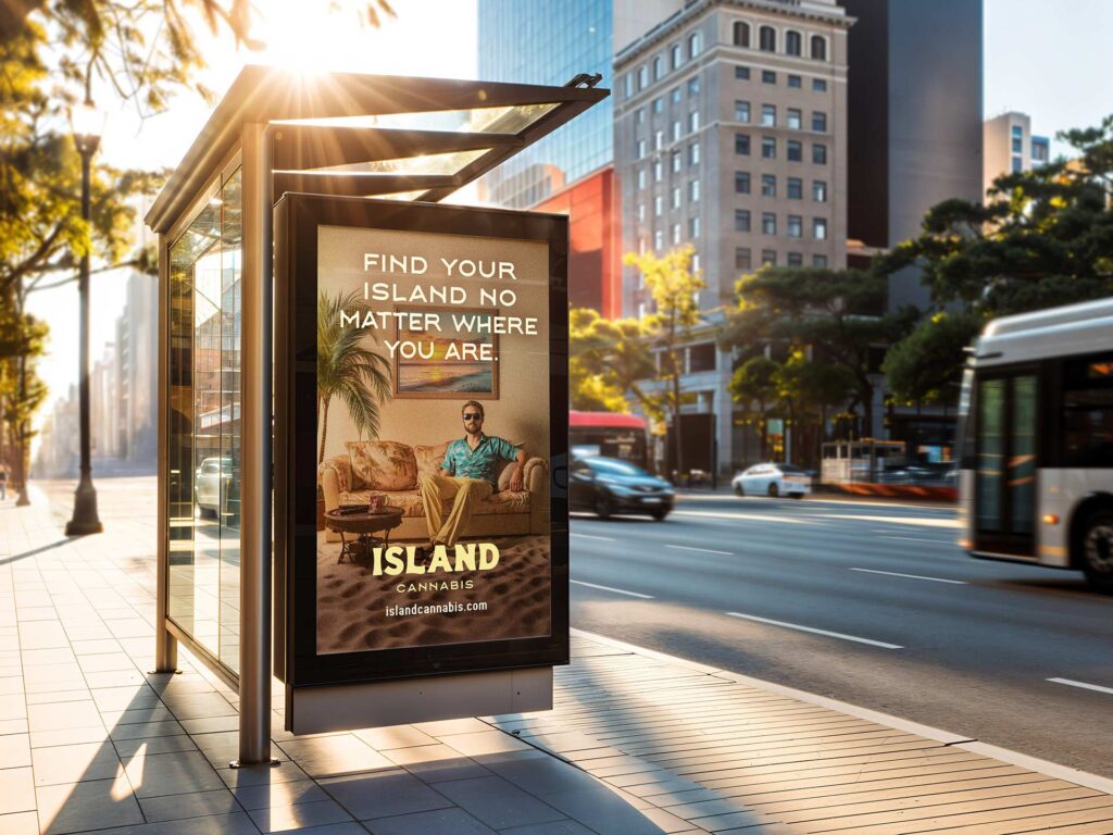
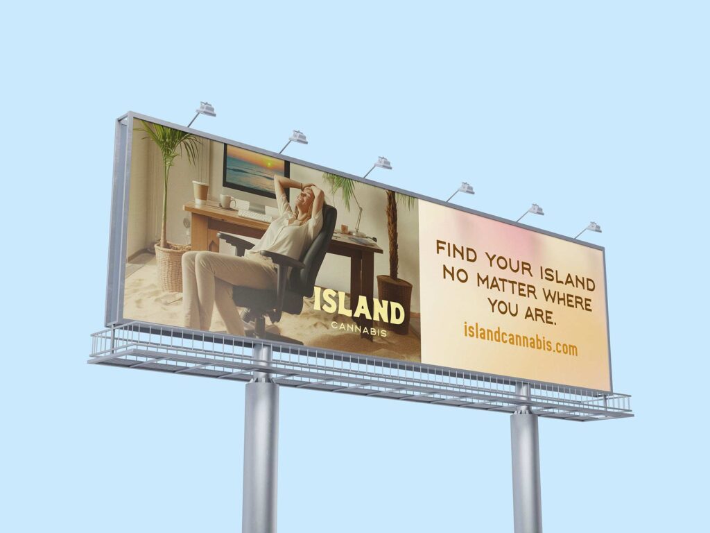
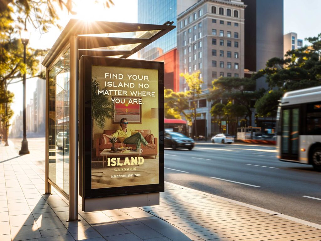
That reframe drove everything. The brand purpose put it plainly: everyone deserves a vacation, even if that vacation is your couch on a Tuesday night. From there came the positioning, that Island brings a piece of the California dream to diverse customers wherever they are, and the tagline, Find Your Island, Wherever You Are. We built the audience around the Islander, a values-driven, quality-focused consumer who folds cannabis into a refined lifestyle rather than letting it define them.
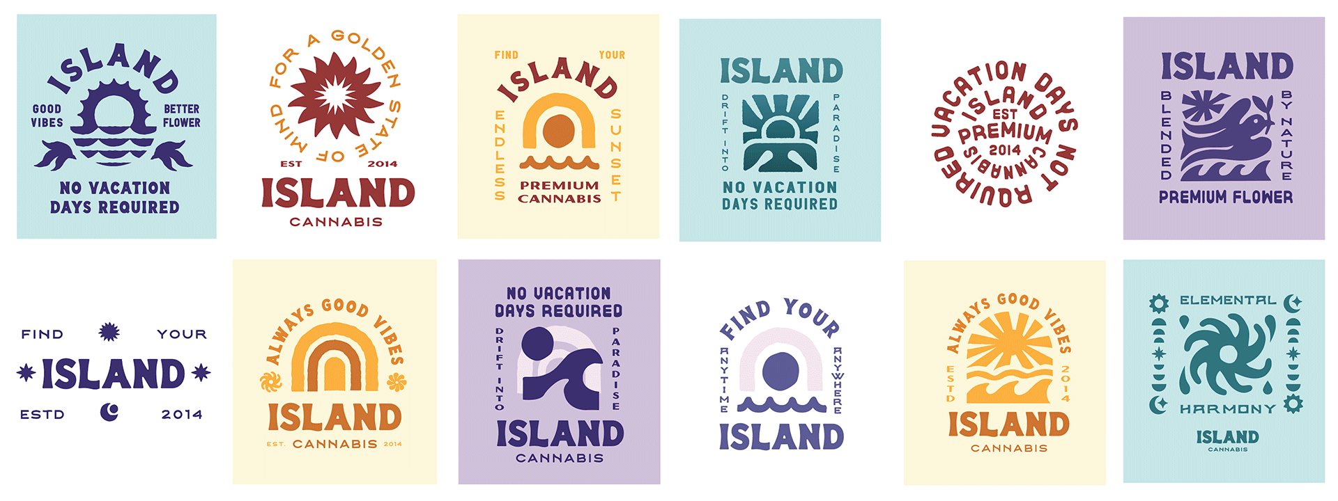
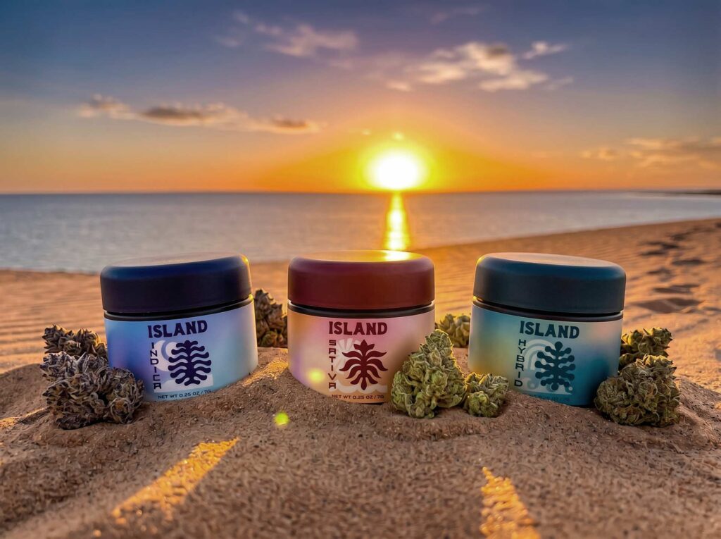
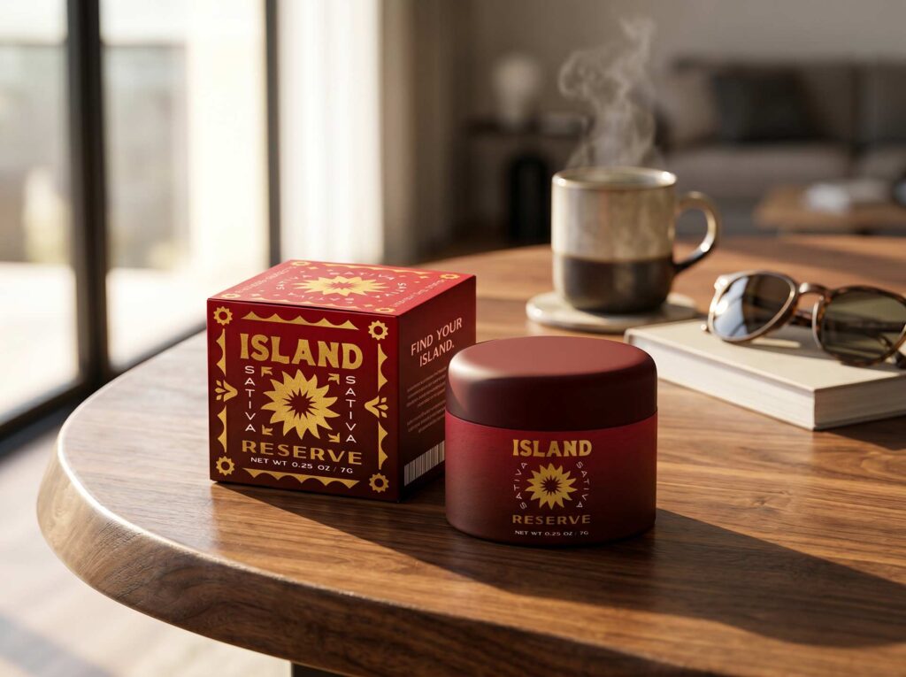
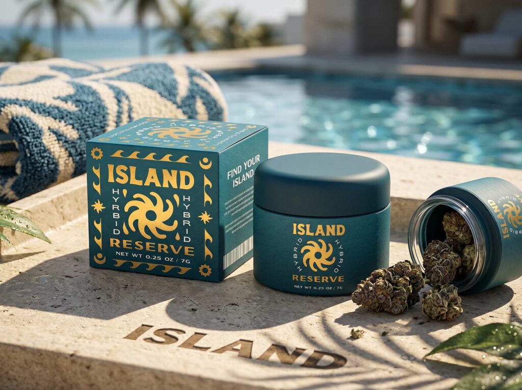
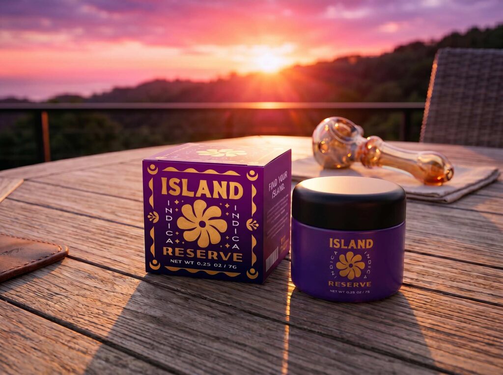
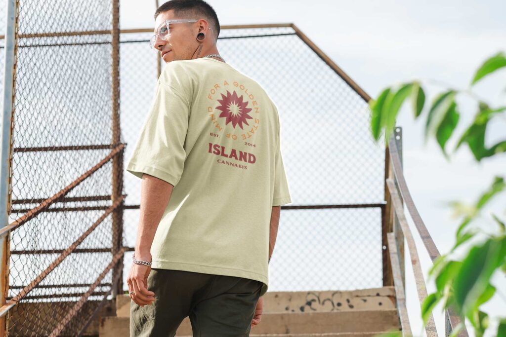
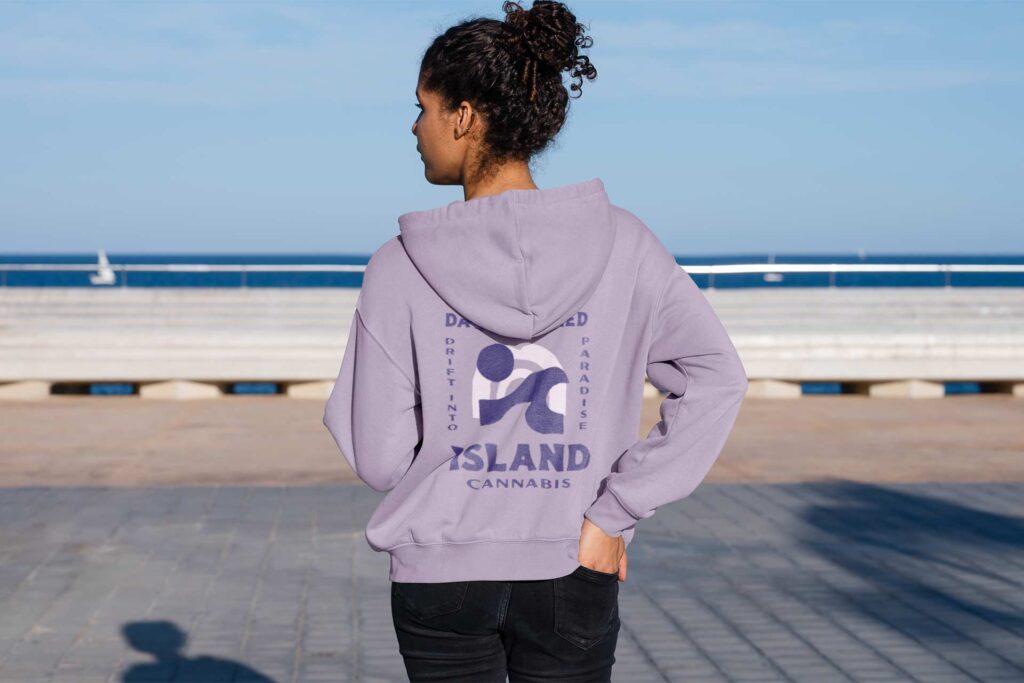
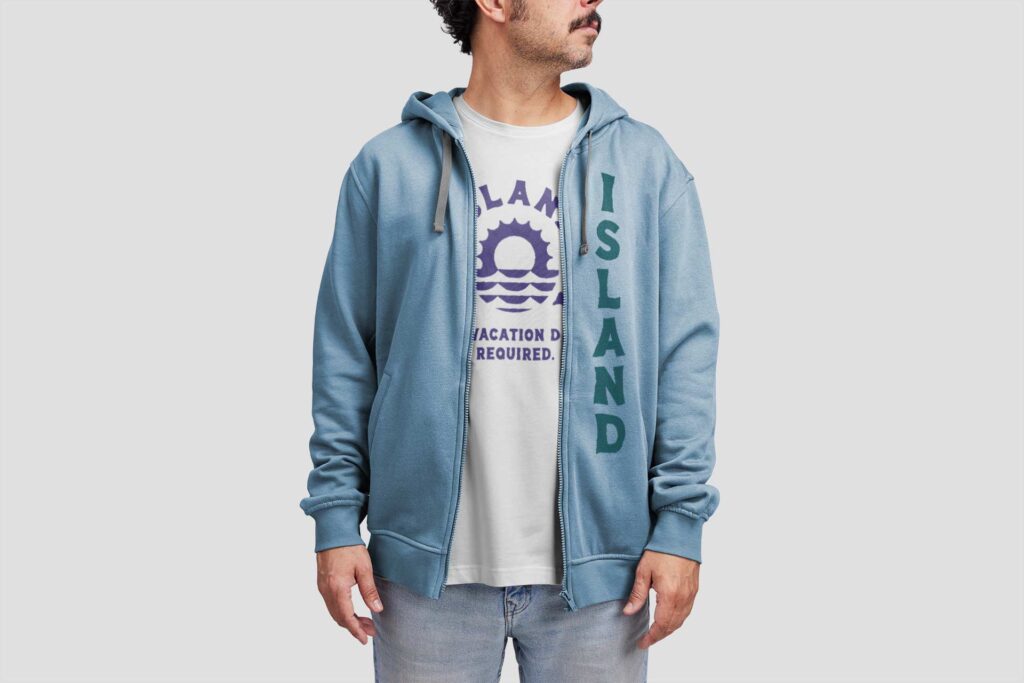
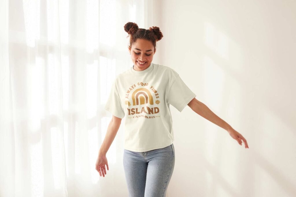
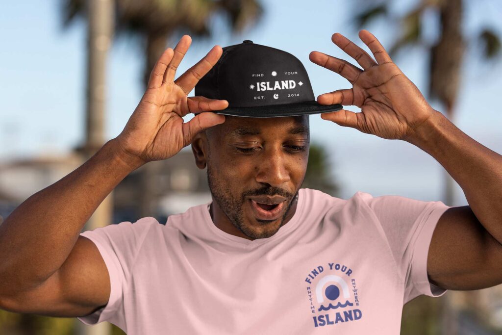
The visual direction is Vintage Craft, treating island and beach culture as a timeless cultural thread rather than a trend, pulling from vintage surf type and the early island cultures of Crete and Polynesia. The logo is a custom bold serif wordmark, classic and textured, set on a sandy kraft-like ground that transports you to a beach without a single literal beach image. The palette runs warm sandy neutrals, terracotta, deep teal, and deep navy, with gradient mesh treatments that evoke sunsets and ocean on packaging and digital. We split it into Island and a premium Island Reserve tier, built a channel-specific messaging system anchored to the Islander, and developed packaging for flower and pre-rolls, apparel concepts, swag, and advertising templates.
The Results
I will not dress this up, because the honest version is the more impressive one. 4Front filed for bankruptcy before the full relaunch could be executed, much of the engagement went unpaid, and Island went out with an inexpensive packaging update rather than the full rollout the strategy called for. What stands is the work itself: a complete, sophisticated brand strategy engagement that took a portfolio from 22 unfocused brands to 8 strategic ones, then rebuilt one of them from research through positioning, identity, and go-to-market. The constraints were real. The quality of the thinking was not compromised by them.
Brand Portfolio: Executed work that transformed the portfolio from a house of 22 logos, to a solidified house of brands.
From audit to shelves: Overhauled Island to be repositioned for success from audit through GTM strategy.